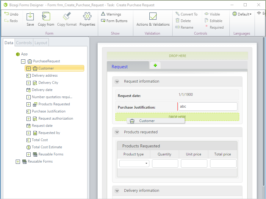
Display Area
The Display Area on the right is where you design a form. To build the form, drag and drop the elements presented in the left panel: attributes from the data model (displayed in the Data tab), controls (found in the Controls tab), and Layouts.
When an attribute or control is included in the Display Area, it will be referred to as a Control.
Adding a Control to the Display Area
When you drag an attribute or a control, the DROP HERE position will highlight (changes to a lighter color) as you hover the mouse pointer above a particular Container. This indicates the position where the control will be placed when you drop it (let go of the mouse button).
Appearance in Display Area
As the Form Designer is a WYSIWYG (What You See Is What You Get) editor, the appearance of your form in the Display Area during editing remains the same in the Work Portal.
- Mandatory controls are highlighted with a red vertical bar. When a control is mandatory, the end user will be unable to submit the activity without the required information being given.
- Read-only controls will have no editable area.
- Controls can be grouped in Tabs, Sections, Groups, and Panels to help you visually organize the content.
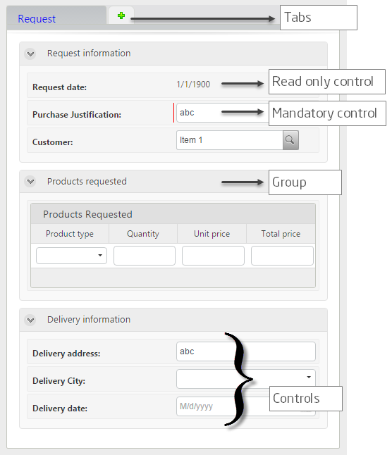
Types of Controls
You will be able to easily identify each type of control by the way it is displayed. Below are some examples of controls in the form:
- Text Control depicted with an
abclabel. - Combo Control depicted as a drop-down list.
- Date Control depicted with a
1/1/1900label. - Table Control with four columns.